

The Psychology of Font Choice and Brand Personality
By Ronn Torossian
Typography shapes how audiences perceive, interpret, and connect with brand messages. Research from Monotype shows that typeface choices can increase positive consumer responses by up to 13%, demonstrating typography’s measurable impact on brand perception. Beyond mere decoration, fonts serve as visual voices that communicate brand personality, values, and credibility before audiences read a single word. Understanding typography’s role in brand messaging helps organizations create more effective, accessible, and emotionally resonant communications across all channels.
The Psychology of Font Choice and Brand Personality
Font selection creates immediate emotional associations that influence how audiences perceive brand personality. According to studies from Wichita State University, serif fonts like Times New Roman and Garamond tend to convey tradition, respectability, and reliability. These characteristics make serif fonts popular choices for established institutions, luxury brands, and organizations wanting to project authority and trustworthiness.
In contrast, sans-serif fonts like Helvetica and Arial communicate modernity, simplicity, and approachability. Their clean lines and minimal styling align well with tech companies, startups, and brands targeting younger demographics. The geometric sans-serif font Gilroy Bold, for example, tested particularly well for perceived innovation and brand prominence in Monotype’s research.
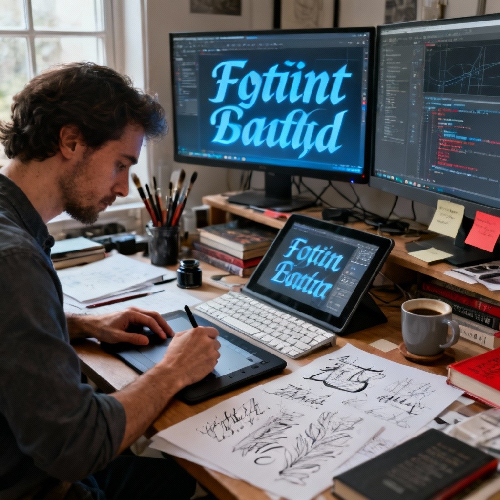
Script and display fonts can add personality and distinctiveness but should be used selectively. While they may reinforce specific brand traits like creativity or elegance, overuse can reduce readability and professionalism. The key is matching font personality to brand voice while maintaining clarity.
For more, click here.